Some art forms are like staring across a large and flat field. Sunday morning comics (do they still exist?) are all the exact same quality. There are no good ones or bad ones. Garfield could be the best of its kind or the worst. There’s no way to tell. Their bell curve is a bell line: a single vertical stroke that is both infinitesimally thin and high enough to leap into the stratosphere.
2D animation is different: its a plain ridged by great peaks and crevassed by huge gulfs. When it’s bad it’s incredibly bad: the worst thing ever conceived of by the human mind is probably animated. But for me, great animation exists on a level that basically nothing that’s not an animation can touch.
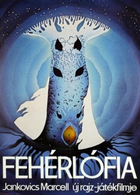
Son of the White Mare, or Fehérlófia, is a 1981 Hungarian animated film that I watched on Peter Chung’s recommendation. I was curious as to what I’d get out of it, considering I know only one Hungarian word, “Tökfej” (lit. “squash-head” but with idiomatic sense between “idiot” and “asshole”), and only because a heavy metal band recorded a song with that title.
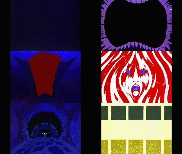
It’s like a Disney film, in that it adapts a folk story (in this case, an “ancient Hunnic and Avaric legend” of the three brothers, Fanyüvő, Kőmorzsoló, Vasgyúró, who fought a war against an army of dragons). But where Disney films are reverent as a dull church service, Fehérlófia is energetic and lively. And where Disney films try for styleless realism, Fehérlófia wants to be like nothing you’ve ever seen before.

A realistic myth is a contradiction in terms, and it wastes no time in trying to be “faithful”. Instead, it’s a surrealist vapor that seems made to be inhaled rather than watched. This is one of those midnight movies viewed by college kids who snicker “what drugs were they on?” Probably none. Something can invoke a psychedelic state without being authored in a psychedelic state – it’s probably easier if it isn’t. LSD is formulated by trained chemists, and pressed into pills by machines.
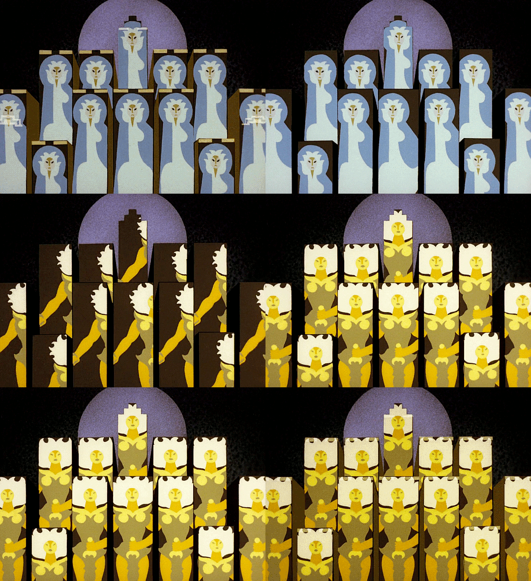
Imagery grows on Fehérlófia’s cel plates like mushrooms on a fallen log. Colors mean things, shapes mean things. It’s a masterclass on how to talk with paint instead of words. I found the voice-acting to be annoying and anti-climactic, and if not for the music (which was nice) I probably would have viewed the film on mute.
There’s a lot of “shape language”, and things get pretty symbolic, with the heroes having rounded, organic shapes and the monsters having an industrial, Soviet brutalist aesthetic. I don’t think Fanyüvő ever calls a dragon a tökfej, but he should have: they’re real pieces of work.
There’s also a psychosexual undercurrent you wouldn’t get from Disney – somehow, Fanyüvő’s sword always ends up hanging between his legs.

It’s technically creative, too. Fehérlófia does not have a single line. Color is allowed to clash directly upon color, without dark penstrokes getting in the way. This gives it a fluidic feel, like watching a lava lamp bubble. And though it might seem the opposite of the “ligne claire“ style of Tintin, it achieves the same effect: combining everything on the frame into the one level. Most animation has a clear distinction between foreground action and background plate. Here, it’s basically all action.
(I’m interested in how exactly the key animator worked. Were lines drawn as a reference and then discarded? Were cels painted freehand?)
It’s a testament to visual storytelling that my illiteracy didn’t seem to matter, because I was fascinated by Fanyüvő’s quest, and the way it was depicted in abstract incinerations of light and color.
The film was created by Marcell Jankovics worked under the auspices of Pannonia Film Studio, one of Hungary’s few native animation studios (One of Pannonia’s alumni includes Gábor Csupó, who co-founded the animation studio known for Rugrats et cetera). He made several films, which have a certain niche appeal. His most famous mainstream moment was probably the film that ended up becoming The Emperor’s New Groove. What’s the the Hungarian version of “Alan Smithee”?
According to IMDB, production was difficult.
According to the director, the animation crew had to work under horrible conditions. Their work building was a rickety wooden construction added to the main studio building. Concept art and other production papers were carelessly littered across the floor and trampled over, as the studio saw no point in preserving them. The celluloid sheets were scratchy and of low quality, and the paint had a tendency to form clumps and crumble off the cels after drying. At one point, 600 completed animation cels had to be thrown out and hastily redone because they were unusable. The animators eventually decided to start manufacturing their own paint, and Jankovics himself helped out with painting the cels. He recalls that the work was so stressful, one of the artists broke out in tears. To buy more production equipment that Pannonia Studio couldn’t afford, the people working on the film even had to take up additional jobs elsewhere.
Movies like this don’t make money. Animation in general was in a slump in the 80s – even Disney was in a precarious situation – and animation for adults has always been a rough sell. The fact that Fehérlófia was made against adverse winds adds to its scrappy charm.
Some things entertain, illuminate, inspire. But some do something more: make a case that their medium is worthy of existence. Fehérlófia is one of the heights of animation. It’s a brilliant, elegant lawyer’s brief for the entire animation genre, showing what’s great about it, and why it’s important.
No Comments »
Comments are moderated and may take up to 24 hours to appear.
No comments yet.

