‘”And here you will stay, Gandalf the Grey, and rest from journeys. For I am Saruman the Wise, Saruman Ring-maker, Saruman of Many Colours!”
‘I looked then and saw that his robes, which had seemed white, were not so, but were woven of all colours. and if he moved they shimmered and changed hue so that the eye was bewildered.
‘”I liked white better,” I said.
‘”White!” he sneered. “It serves as a beginning. White cloth may be dyed. The white page can be overwritten; and the white light can be broken.”
‘”In which case it is no longer white,” said I. “And he that breaks a thing to find out what it is has left the path of wisdom.”
– JRR Tolkien, Lord of the Rings: The Fellowship of the Ring – Book II Chapter 2, The Council of Elrond
I, like many people, shudder over Thomas Kinkade paintings…but why is this? What, exactly, is bad about them?
I read a Reddit discussion on the topic. Most of the respondents answerers couldn’t answer except through “opium contains a dormitive principle” tautologies.
It strikes me as kitschy, and kitsch is not art.
it is art for the lowest common denominator.
His marketing strategies are targeted at lower class Americans. His works are not owned by the upper classes, which is notable for any product but especially art which always purports to be noble (and Kinkade more than most artists wants to be perceived as high-minded).
it’s not Art; on the spectrum of art, it falls squarely in the “decoration” camp. There’s no deeper meaning, no depth, it’s simply trying to be a pretty picture
It’s considered bad taste because it marks you as someone who isn’t familiar with much art, or hasn’t thought much about it. If you’ve seen a lot of art, spent time paying attention to it, or compared pieces, styles and movements, you will probably find Kinkade very dull.
“he sucks, he’s bad, if you like him you’re an Ump-Tray Upporter-Say, etc”
Perhaps Kinkade’s work is so obviously bad that it’s not even worth analysing. It’d be like trying to quantify why a cockroach is so repulsive. Art is about instinctive, unlearned responses, after all. There’s little need to “analyze” art when the response is the aesthetic equivalent of a white phosphorous explosion.
But refusing to analyze things can lead to blind spots – it’s still interesting to consider what makes a cockroach more disgusting than, say, a woodlouse or a mouth. And it’s interesting to consider why Kinkade’s art is uniquely bad, when other similar art isn’t.
With respect to Gandalf, it’s time to break apart the Painter of Light.
1) Kinkade’s art communicates nothing
Art is defined as an artist’s attempt to create meaning in the mind of the audience. What’s meant by “artist” (and “meaning” and “audience”) is up for grabs. But there always has to be some element of communication. Art is the bridge for the artist’s ideas.
This is what separates artwork from wallpaper. It’s also why I have reservations calling the work of Dalle-2 “art”, even though it might look like it.
The triumh of the modernist movement was to understand that art is also an interpretive process. A work of art can be understood differently by different people, and the meaning might change depending (: the meaning can va).
But by the same token, it’s not totally up for grabs. But there has to be something. Art exists to say things. Just as language exists to say things.
Kinkade’s paintings say “goo goo ga ga”.
They’re bland collisions of soggy, overly sentimental imagery and branded Disney characters. The aesthetic impact they have (for me, sickened), seems almost accidental: Kinkade seems to have painted each one with dispassion bordering on contempt, working down a checklist of “nostalgic” signifiers.
2) He doesn’t understand that less is more
Do you like beer? Enjoy a cold brew over dinner, perhaps?
Well, Thomas Kinkade just threw you into an enormous 5000 gallon vat of beer. Salud!
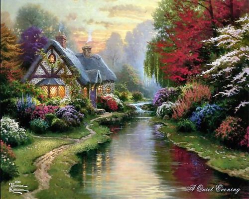
Any chance his paintings have of creating a nice mood is spoiled by the fact that he does it to excess. When looking at Kinkade’s paintings, you get the feeling that you’re looking at a fighting game where the “Cute” and “Whimsy” sliders are stuck on maximum. This is the essence of kitsch. Sometimes this creates a ludicrous effect: with elements of the paintings not even seeming to exist in the same world. For example:

It’s the middle of the day. But every window is aglow with firelight, as would only happen at night. And who would build a cottage on low ground right next to a stream? Streams flood. After a week of heavy rain, the water would be up to the wainscoting. These are little things that shatter the impression of a unified world.
3) Almost all interesting art grapples with ugliness in some way
I don’t mean it has to be about or predominently feature ugliness. But Kinkade’s paintings deliberately do not feature it at all. As per his instructions:
The concept of beauty. I get rid of the “ugly parts” in my paintings. It would be nice to utilize this concept as much as possible. Favor shots that feature older buildings, ramshackle, careworn structures and vehicles, and a general sense of homespun simplicity and reliance on beautiful settings.
The image above shows off this philosophy in action.
He wants firelit windows…but doesn’t want a night scene. Because night is scary and forbidding. Very few Kinkade paintings depict night, and the ones that do normally turn it into a ghoulish purple-pink twilight that resembles a scene from an alien planet.
Here’s another one:
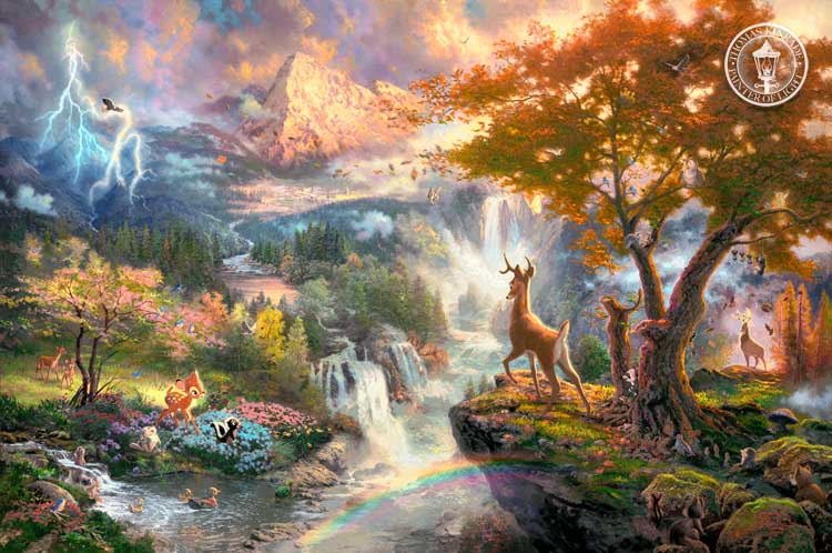
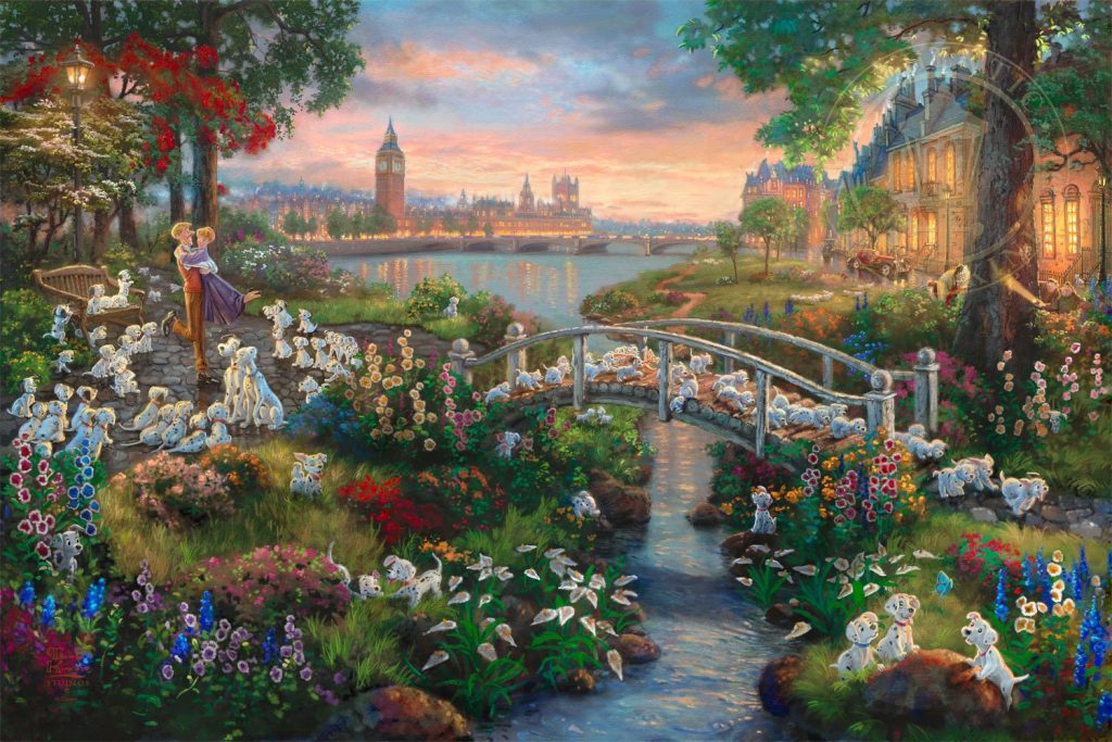
Another Kinkade signature move is branded Disney characters. Here he tries to capture the entire story of Bambi on one frame, and produces an overstuffed exercise in claustrophobia. Aren’t there sad and scary parts in Bambi’s tale? Not according to Kinkade.
There’s an essential phonyness to Kinkade’s work that shines through even when he adapts Disney. His work is too idealized to be realistic, yet too enslaved to familiarity and folksiness to succeed as a work of imagination or fantasy.
3) He was not what he appeared to be.
Kinkade was a self-promoter and an entrepeneur: being a painter was incidental.
Yes, he worked hard on his paintings. Not because they had value in themselves (even as investment assets, many people who were suckered into buying them found themselves holding unsellable and unvaluable paintings), but because they were his brand, his business.
“Putting Thomas Kinkade in an art-historical context is like trying to put Jack Chick in the context of the illustrated comic strip,” – Peter Frank. A striking comparison.
Technically, Jack Chick is among the most successful comics creator of the 21st century. But it doesn’t seem right to describe him as a comics artist. He was a religious evangelist: the comics were a means to an end. Likewise, Kinkade’s pose as a “painter of light” is a cheap mask over the kind of hyper-aggressive Type-A personality cluster you see in Wolf of Wall Street and Glengarry Glen Ross. The type and tries to “close” three grannies before lunchtime.
His skilled technique makes it worse, in a way. If his art was dashed-off rubbish by an amateur, its lack of quality would be understandable. Instead, Kinkade worked hard to make his paintings suck.
His business-focused approach was unusual among artists. First, he identified a need in the market. Cosy, nostalgic imagery. Then he “iterated over a cycle”, in business speak, eventually achieving product market fit. He made himself tens of millions of dollars selling fairly worthless art.
Artists do not normally trademark names for themselves. Nor do they mass-produce their own work. Kinkade was incredibly succcessful, in the sense of making money. He was also so bad that his paintings almost have secret lives as depictions of folkcore dystopias. (This page describes Kinkade as the “Painter of Shite”, which is so banal and obvious that it might be the Thomas Kinkade of insults.)
1 Comment »
Comments are moderated and may take up to 24 hours to appear.
It sounds like your a jealous little sour grapes shit.You have a couple of thoughts like lights on during the day and a building structure to close to a stream, but give the public a break you pompous twit.
Comment by Bill — 2024-02-21 @ 15:59